ATL AIRLINES
Objective: Create a hypothetical interface for the Hartsfield-Jackson atlanta International Airport app for an audience of relatively inexperienced Flyers
Phase 1: Research + Sketching
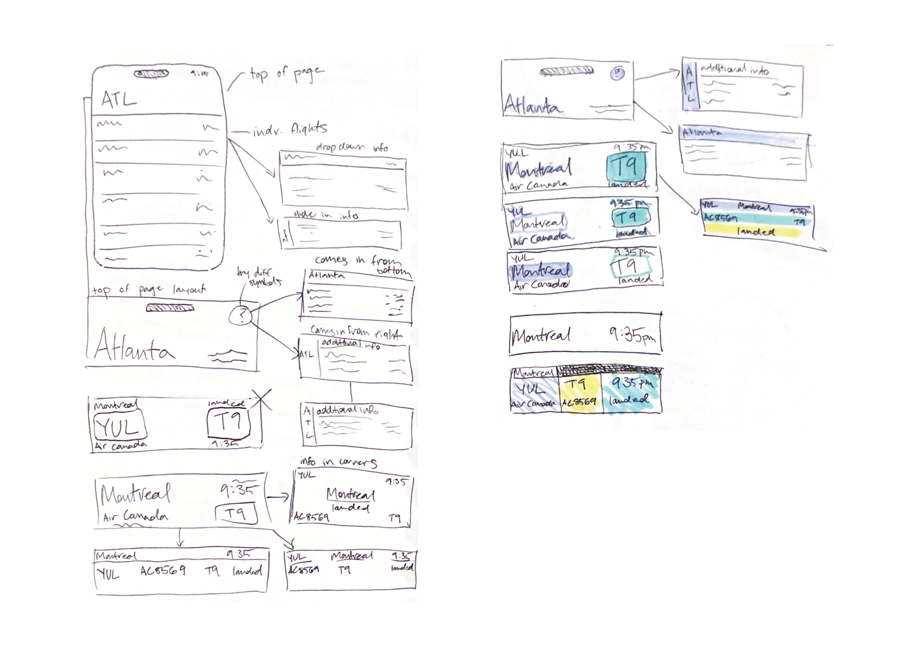
Following research and observation of airport navigation systems and signage, I conducted initial sketches and organized those sketched elements into screen layouts. These elements included the header (which displayed the name of the airport), initial menus (displaying broad info such as flight location, time, and gate number), and dropdown menus which display more specific info.

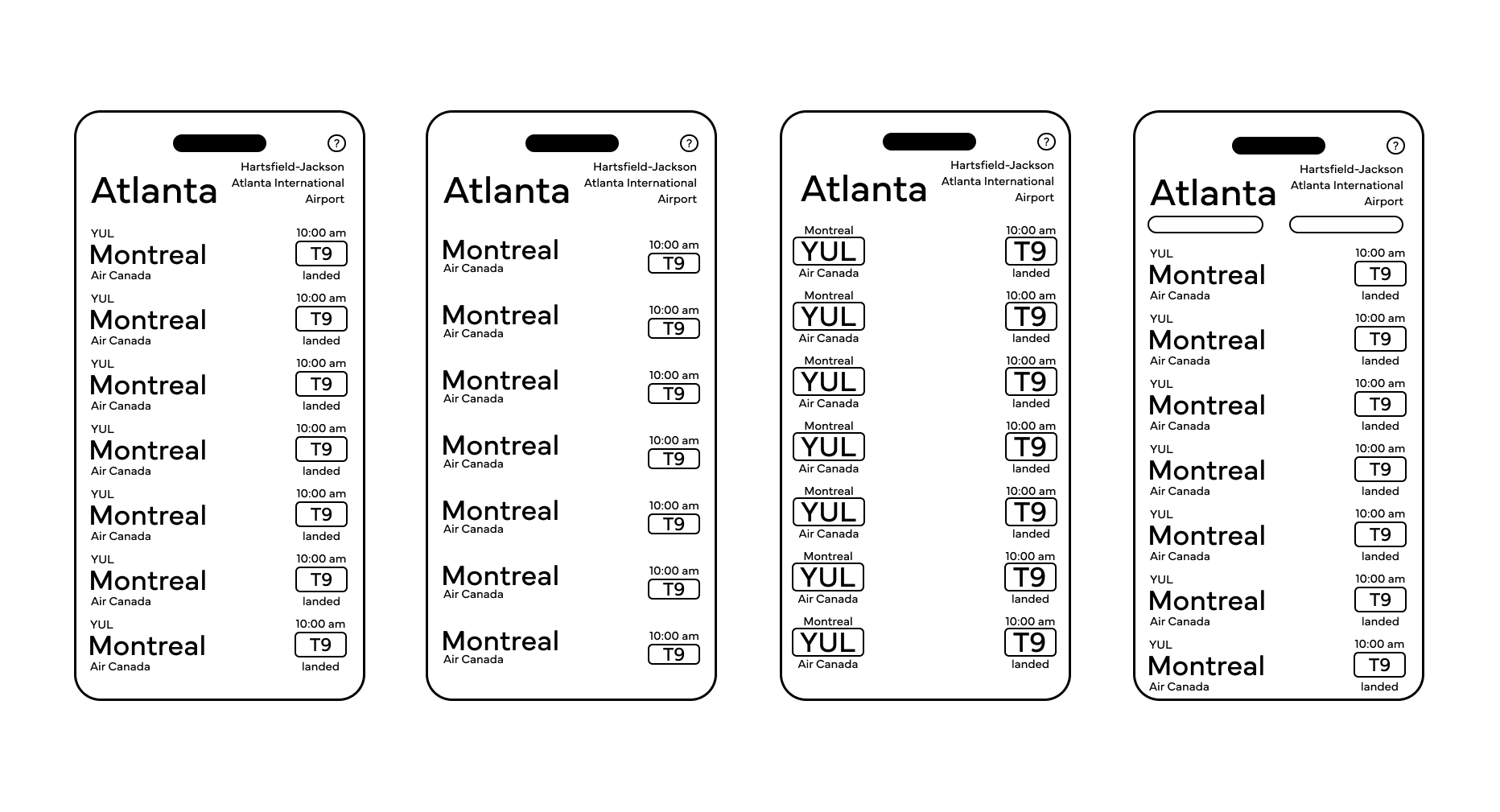
Phase 2: digital translations
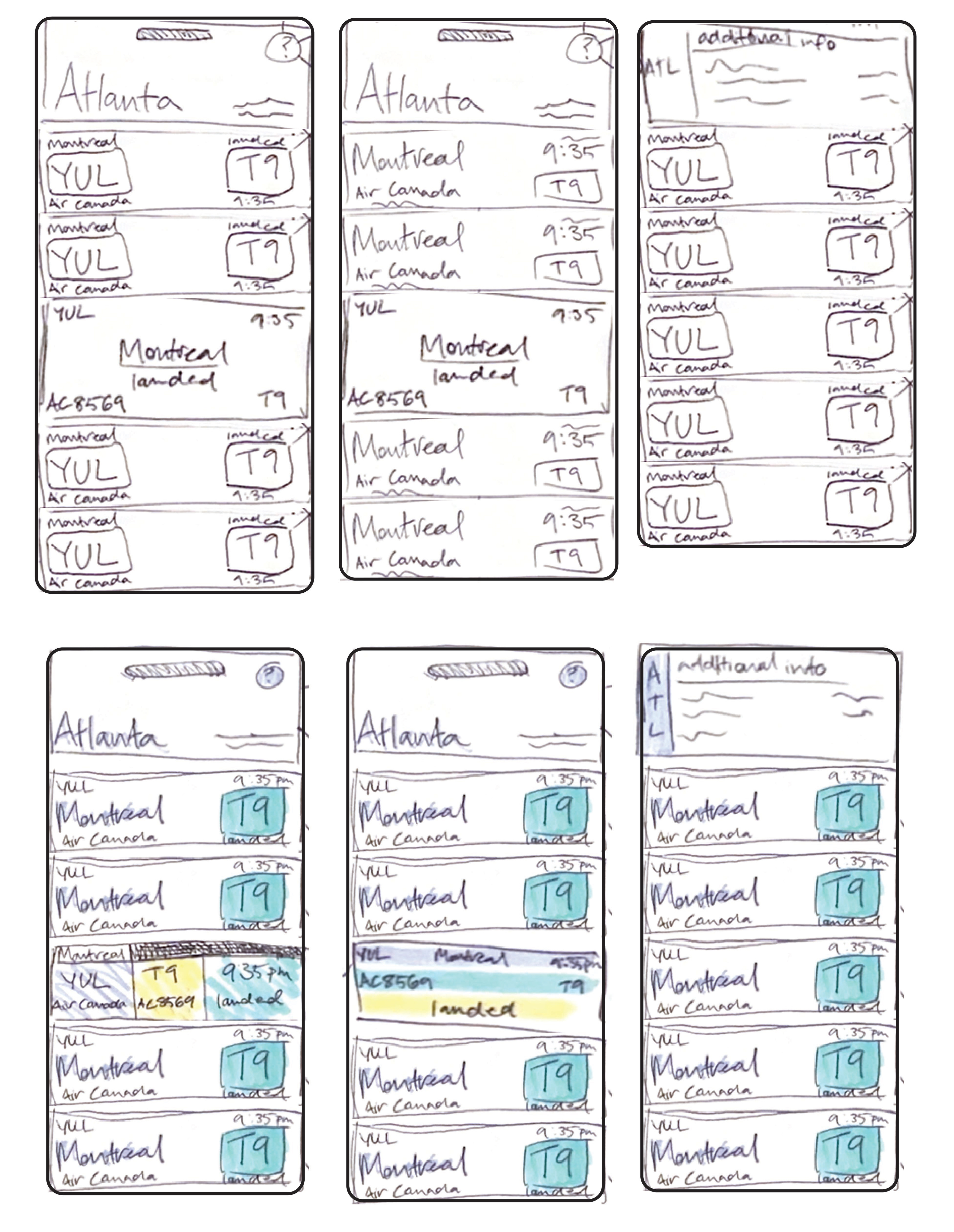
I moved the sketched elements into digital translations and experimented with different combinations and layouts.
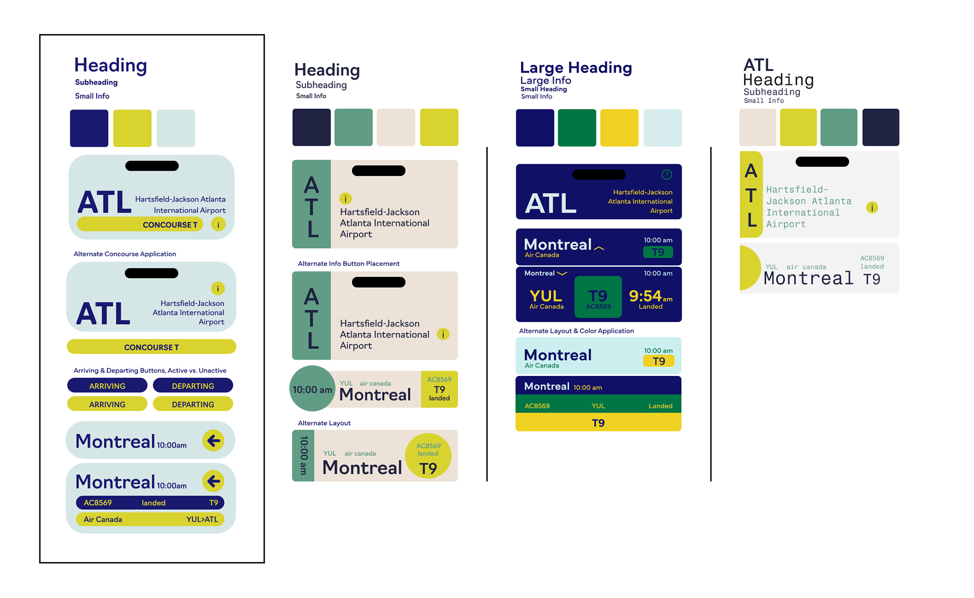
Phase 5: development of design 'systems'
Making use of my predefined typeface and color combo exploration, I made a series of design 'systems', using an outlined concept to create a header element, individual flight info element, and a dropdown menu. I chose to move forward with the boxed system.
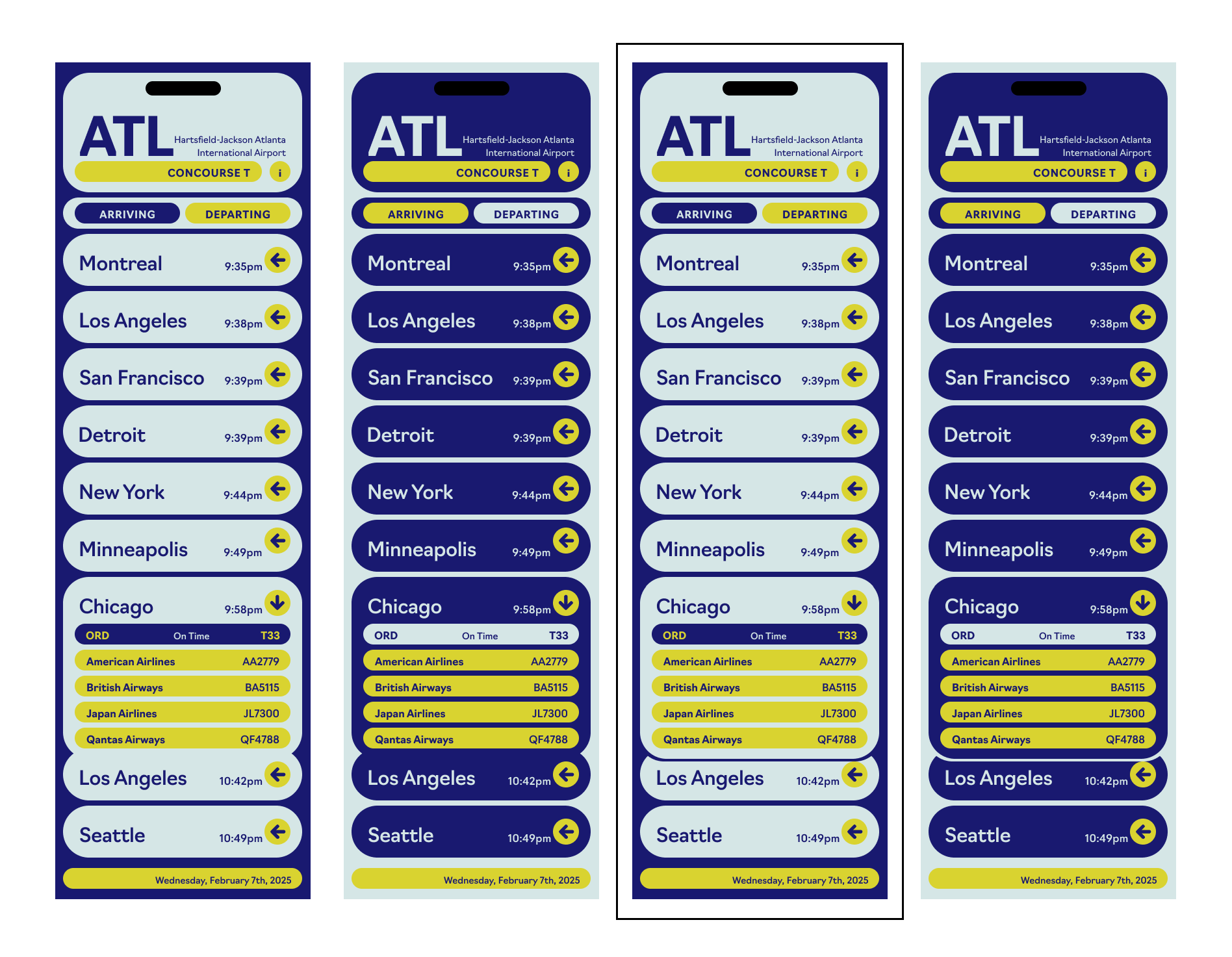
Phase 6: experimentation with color application
Moving forward with my chosen design system, I experimented with a few different applications of the color palette. Also, I experimented with adding an outline at the bottom of the dropdown menu in order to more easily differentiate between the dropdown menu and the flight below it. Ultimately, I chose to move forward with the application with a dark background and an outline below the dropdown menu.
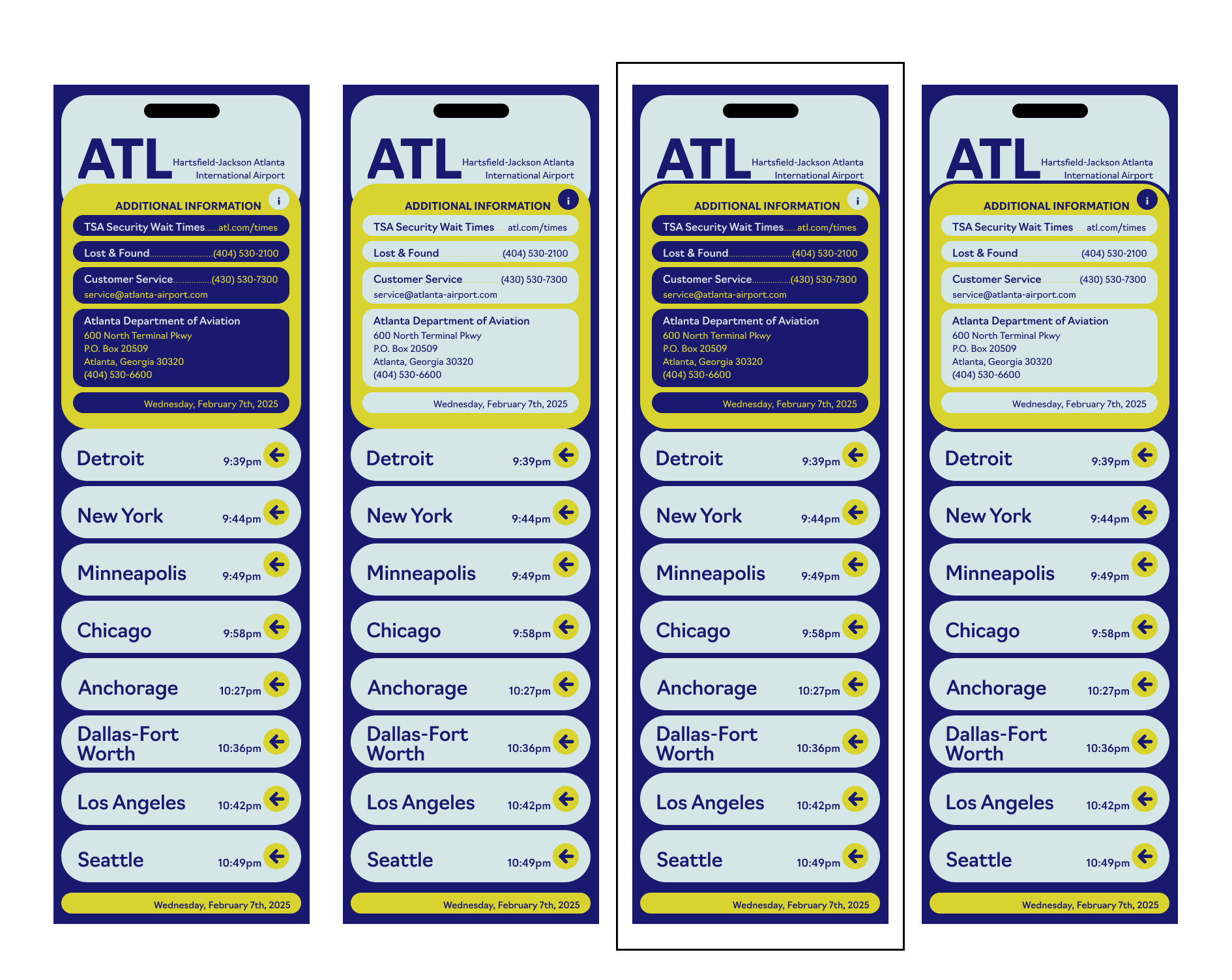
Phase 7: ideation on Additional info
Again, I ideated on the application of color, this time within the 'additional info' screen. I experimented with dark vs. light color applications, and again with putting an outline around the element.
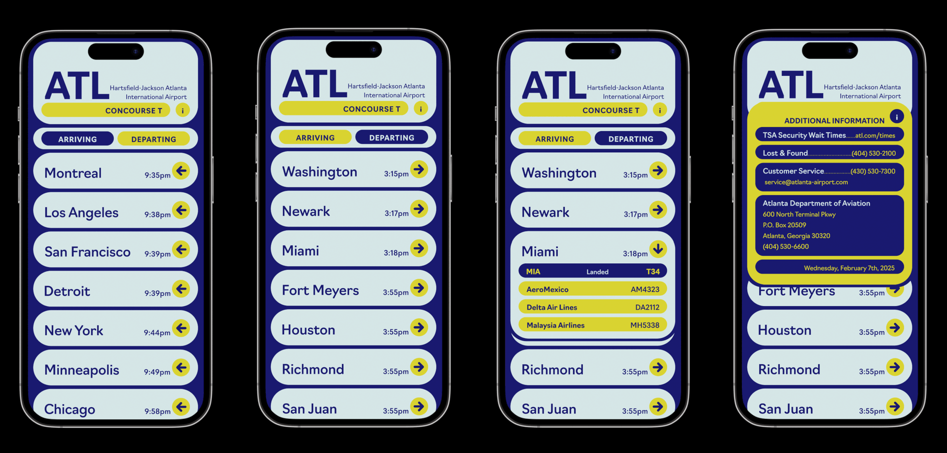
FINAL ELEMENT DETAILS
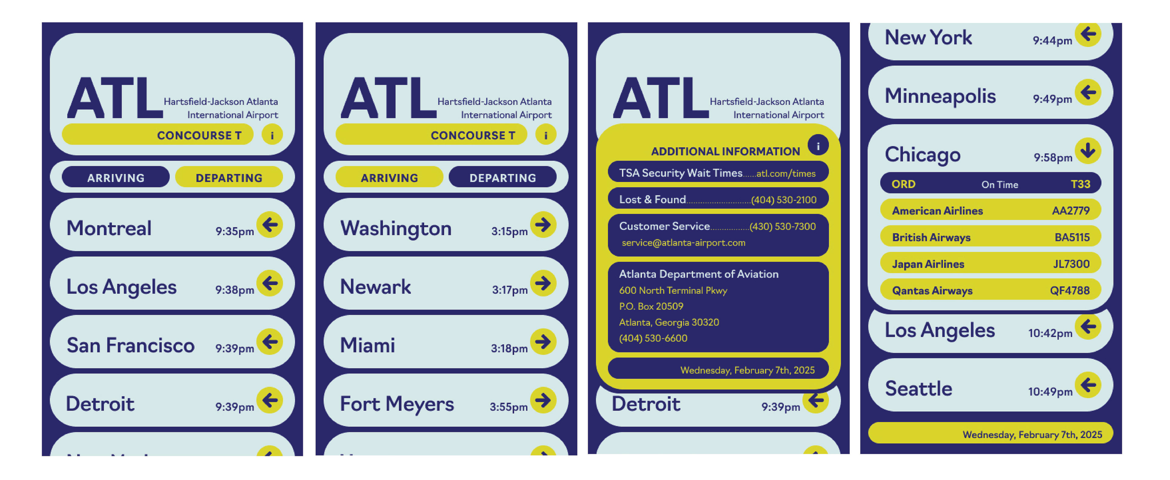
FINAL INTERFACE