against the machine
Objective: Using experimental techniques, create a series of three posters for a set of hypothetical poetry performances.
Phase 1: Poet + thematic research
After writing short passages about the backgrounds and influences of my poets I found that, through multiple of their works, these poets process the ever-developing link between humanity and technology and how this link creates (mostly negative) effects upon society and its various facets.
Phase 2: mind mapping
After mind mapping the common themes of my three poets, I decided that I wanted to focus on the sci-fi and dystopian aspect of the 'Against the Machine' collection, bringing forth the rebellious tone that is present in these genres as a whole.
Phase 3: experimentation with text placement/hierarchy
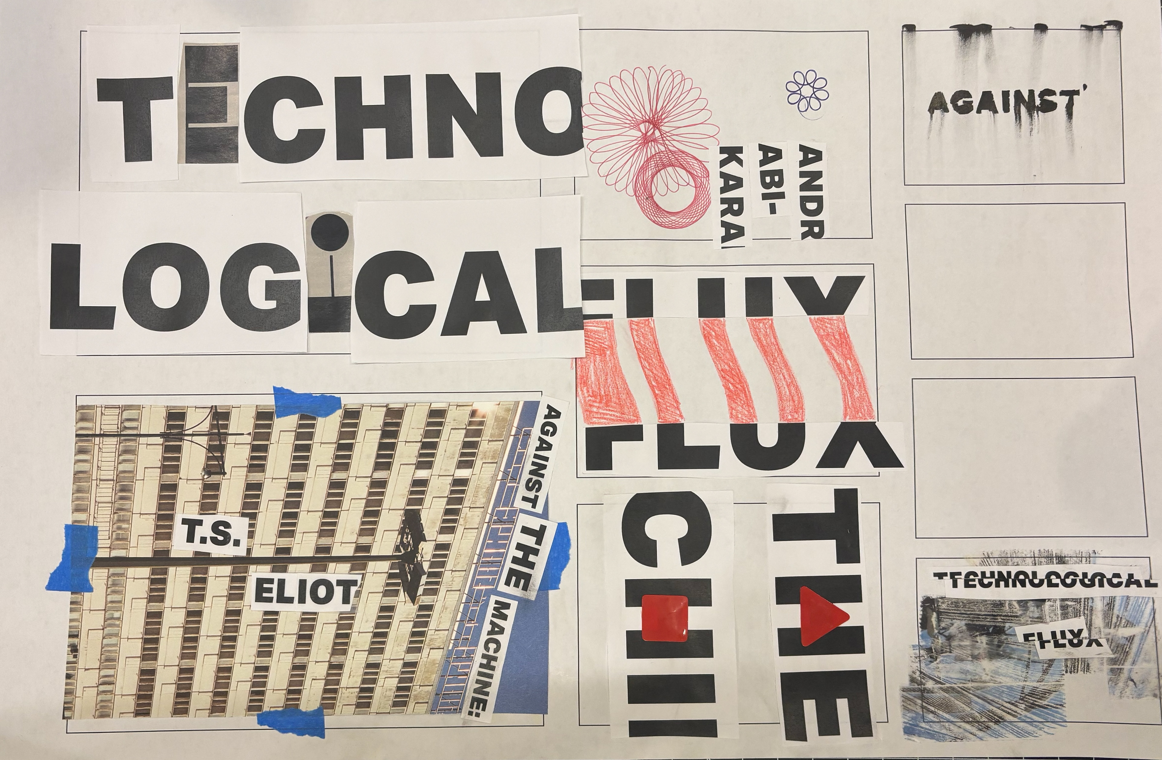
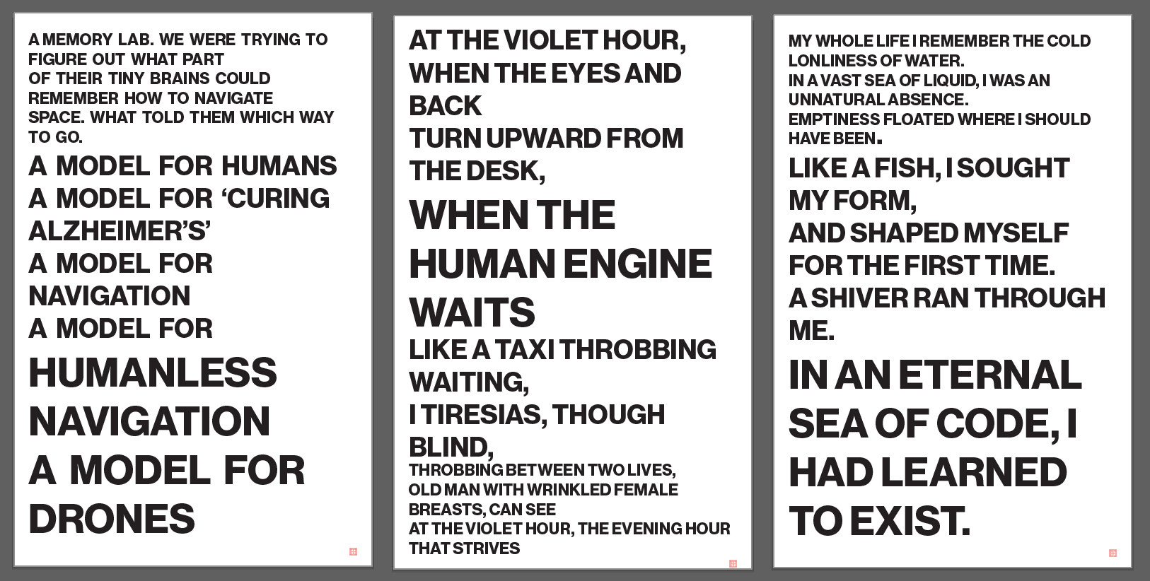
Before embarking further in my computer-based design, experimented with placement and hierarchy of text by arranging printed pieces of my text on a blank sheet of paper, then photographing them.
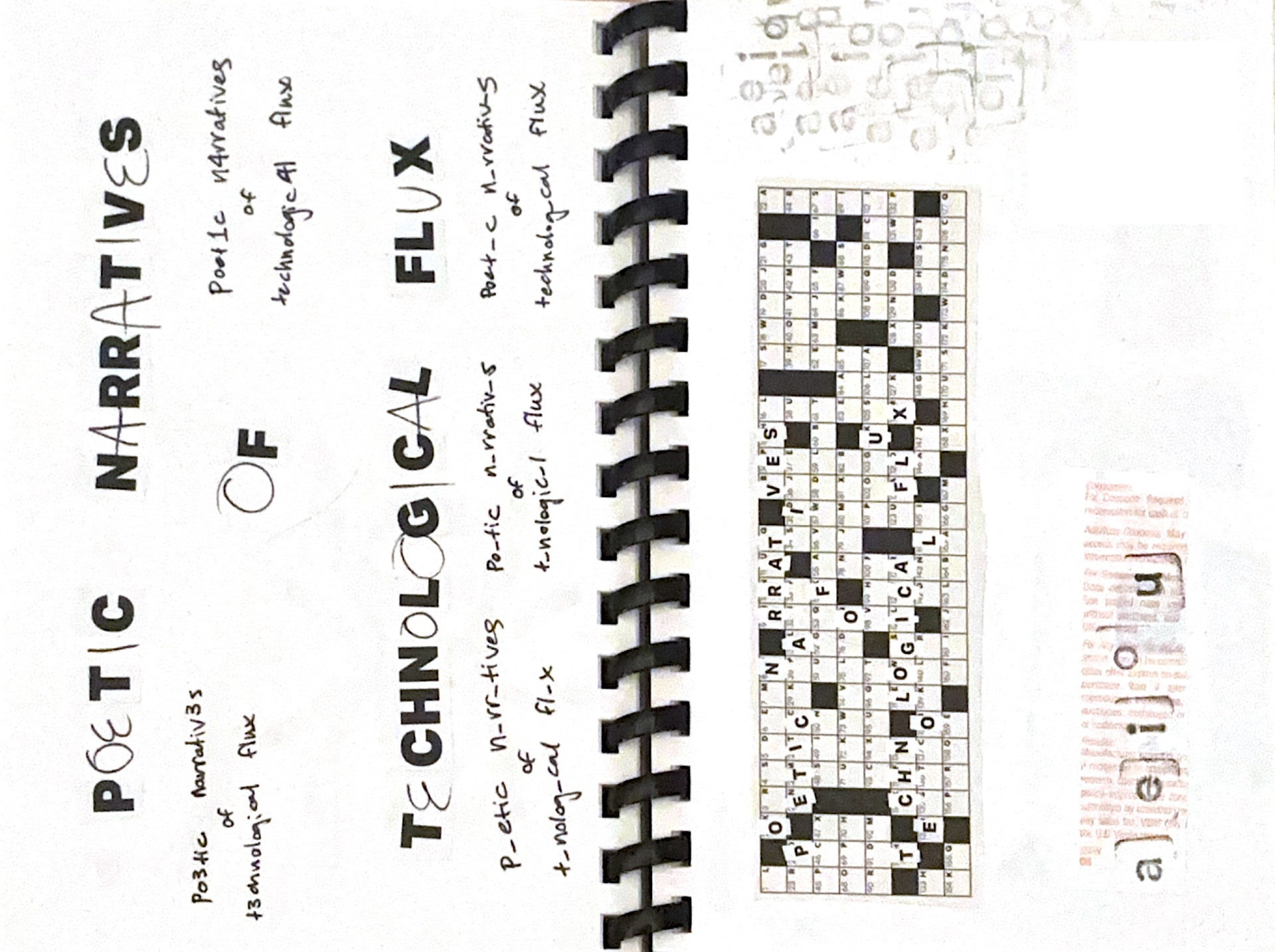
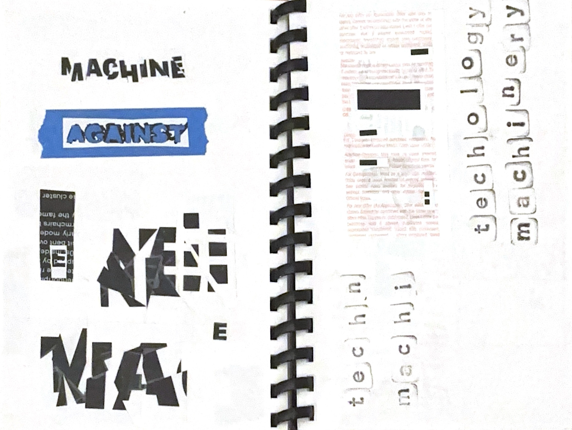
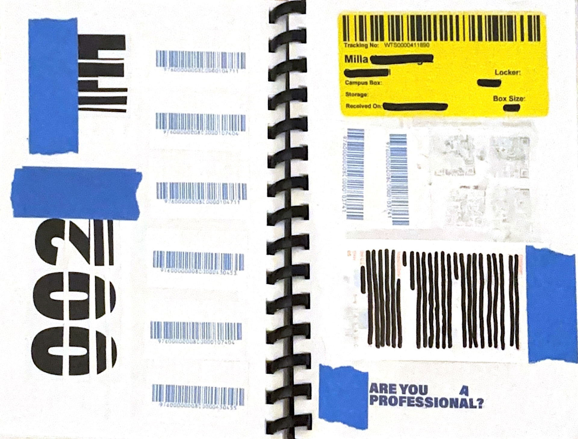
Phase 4: Visual journalinG
I used my previous printed words as well as various receipts, labels, barcodes, stamps, drawn elements, and magazine scraps to journal various visual ideas I had for the posters. I used techniques such as collage, redaction of certain letters/words, and slicing of words and letters to create a fragmented effect.
Phase 7: initial poster construction
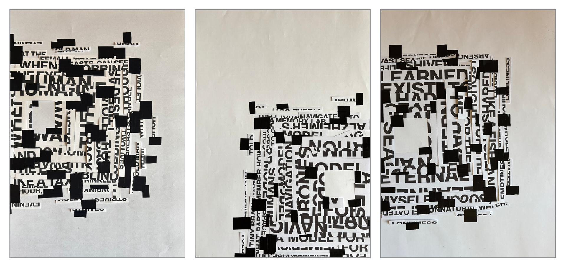
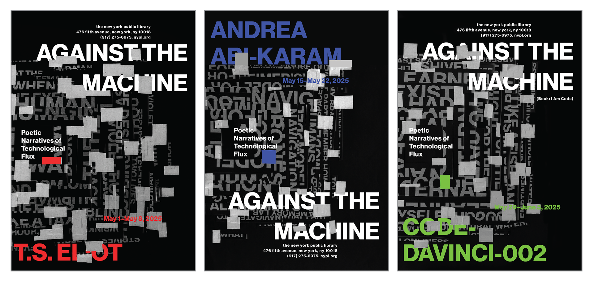
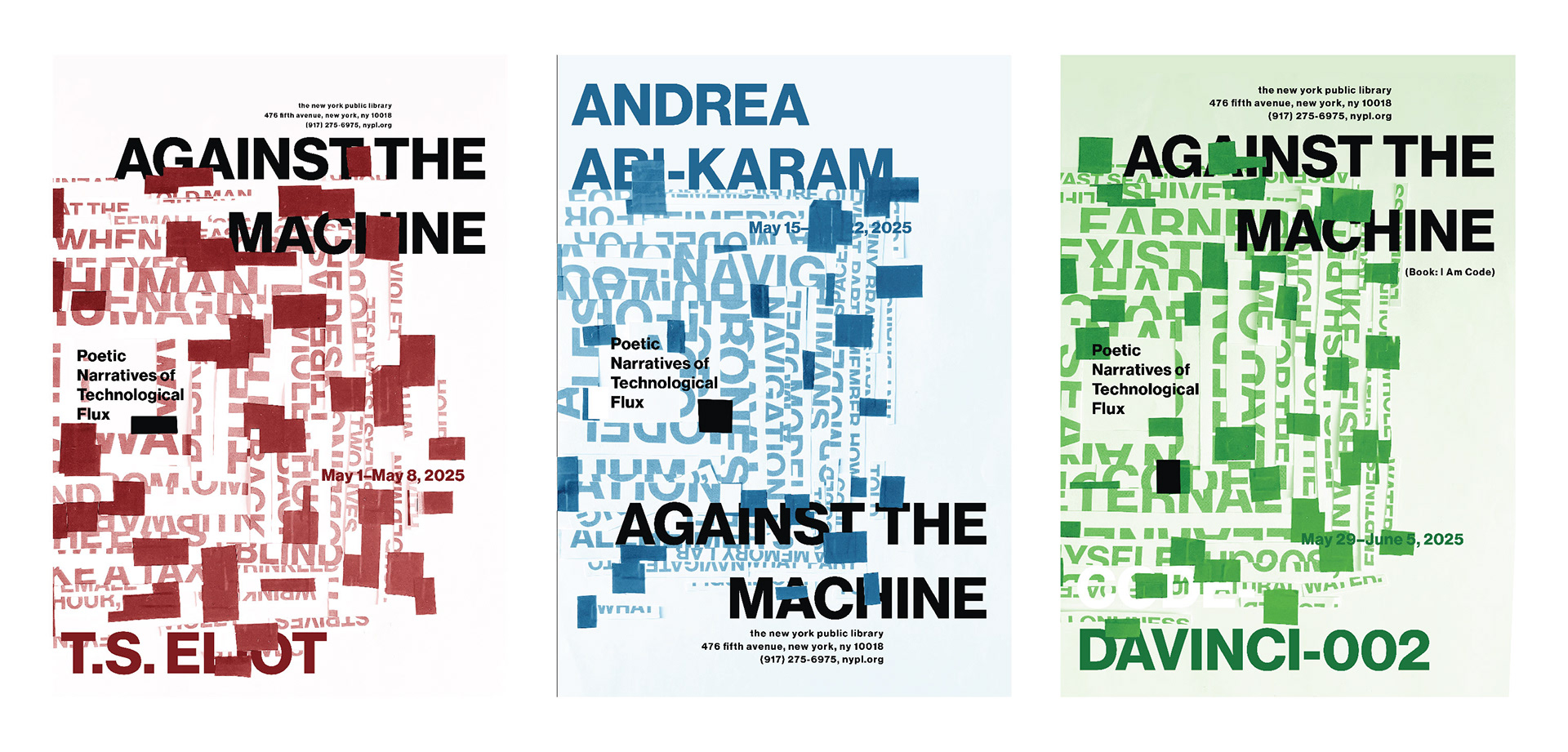
I created new 'matrix' collages using text fragments from works of each poet respectively, then applied the title, poet names, and secondary text to each collage using Photoshop. I changed the accent colors in Andrea Abi-Karam to blue and Code Davinci-002 to green in order to further differentiate between poet posters, and create further uniformity to establish the posters as a series.
Phase 8: experimentation with color application
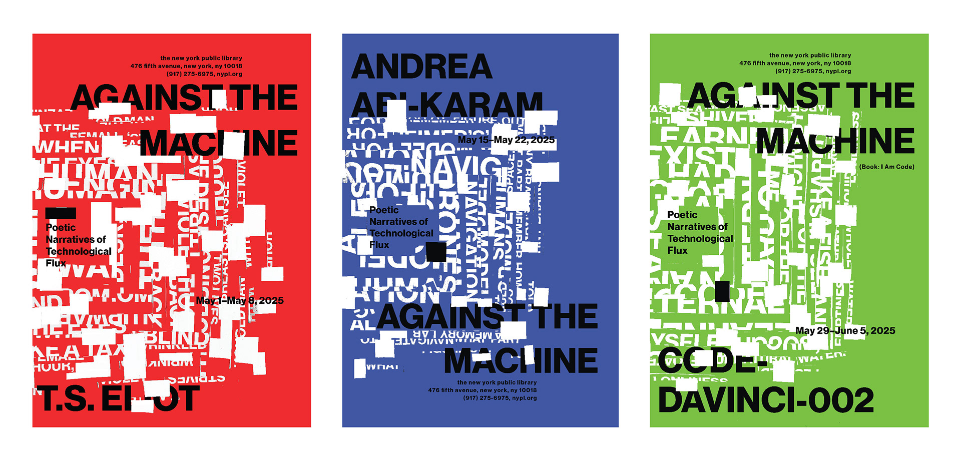
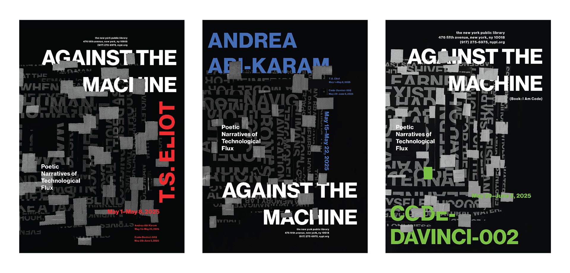
Following initial poster construction, I decided to experiment with the application of the accent colors, applying them to the background of the poster rather than the text. Upon this experimentation, I decided that the black background was better for differentiation between collaged text and informational text, so decided to move forward with that color application.
Phase 9: experimentation with text application
After deciding on a color application, I experimented with the placement of informational text on my collaged background. I alternated the placement of the title and poet name at the top and bottom of the composition, as well as turning pieces of text vertically. The boxed ideations represent the versions I chose to move forward with when making final adjustments.
Phase 10: final adjustments
Looking at my series, I decided to adjust the text elements to create more uniformity between the posters, making the date vertical on each poster rather than alternating between different vertical elements.
FInal poster series
